


Samsa Samsa

What is brand imagery?

Brand imagery is the look of every picture a brand puts out, and brand imagery guidelines are the chapter of the brand guidelines that fixes it: photos, illustrations and, these days, AI-generated visuals. You will also see it called a photography style guide or imagery guidelines.

The chapter is not about one good picture but about what all your pictures share. A great photo can match your brand by accident. The series shows whether the rules hold, down to the twentieth shot from a photographer you have never met, the agency’s banner, or the visual a colleague generates at 5 pm on a Friday.

It is also the chapter brand manuals most often leave to adjectives. Of seven public brand manuals Samsa read in October 2026, not one sets a rule for materials.

Which decisions do brand imagery guidelines need to make?

Brand imagery guidelines need to make eight decisions: light, colour, framing, viewpoint, subjects, people, materials and finish. Each one is written as a rule an outsider can check against the picture, not as an adjective.

The eight decisions of brand imagery, and the checkable rule that replaces the adjective
DecisionWhat it settlesA checkable rule (example)The adjective it replaces
LightSource, direction, hardness, time of day, bright or dark“Daylight from the side, no flash, never midday sun”“bright”
ColourDominant colours, accents and where they go, warm or cool, saturation, blacks“Warm tones, dense blacks, no black and white without a reason”“warm”
FramingWhere the subject sits, distance, space for text, cropping per format“Subject in the right third, one third left free for text”“clean”
ViewpointCamera height, close or wide“At eye level, never from above”“approachable”
SubjectsThe motif families, and what you never show“Four motif families; no light bulb to mean ‘idea’”“authentic”
PeopleWho, how many, faces or hands, gaze, posed or candid“Real employees, looking past the camera”“diverse”
MaterialsSurfaces, materials and props that recur“Linen, oak, stone; no glossy plastic”“premium”
FinishDepth of field, background blur, grain, retouching, filters“Softly blurred background, light grain, no beauty retouching”“high-end”

An adjective lets everyone else decide for you: “warm” is golden backlight to the photographer, an orange filter to the agency and its default look to an image generator. Next to the eight decisions, the guidelines keep two lists: do’s and don’ts, shown as pictures, and usage, which image goes on which channel and in which format.

What do real brand manuals define, and what do they leave open?

The seven public brand manuals Samsa read in October 2026 all set a rule for light and all address colour; none sets a rule for materials, and only one has a rule on AI-generated images in its imagery chapter.

They are the manuals of the City of Vienna, Philipps-Universität Marburg, the University of Amsterdam, the Robert Bosch Stiftung, the City of Fribourg, the Swiss State Secretariat for Economic Affairs SECO (for EasyGov) and the Canton of Zug: public bodies and a foundation, no software vendor and no Samsa customer. Samsa read each imagery chapter in full and noted, decision by decision, whether it sets a checkable rule, stops at an adjective or says nothing. Seven manuals are not a statistic.

What the imagery chapters of seven public brand manuals define, read by Samsa in October 2026
DecisionManuals with a ruleOne example
Light7 of 7Vienna: “Keine hohe Sonneneinstrahlung, kein Kunstlicht” (no high sun, no artificial light)
Colour6 of 7 (Marburg: an optional filter only)Fribourg: “Noirs denses et non-bouchées” (dense blacks that keep their detail)
Subjects6 of 7 (Bosch: adjectives)SECO: work situations that look natural
Viewpoint3 of 7Bosch: at eye level, at most slightly from below
People3 of 7Amsterdam: a balance of genders, cultural backgrounds and age groups
Framing2 of 7Bosch: every photo must work in landscape and in portrait
Focus2 of 7Bosch: “charakteristische Unschärfen zur Fokussetzung” (deliberate blur to guide the eye)
Finish4 of 7Amsterdam: “Photos are not edited.”
Materials0 of 7–
AI-generated images1 of 7Amsterdam: “AI is not used for realistic images.”

Fribourg lists among the photos to avoid “Blancs surexposés, des noirs bouchés ou grisés”: blown-out whites, blocked or greyed blacks. That is a rule you can check on the picture. Mood, on the other hand, stays an adjective everywhere, as in Bosch’s “Authentisch, Menschen- & werteorientiert” (authentic, people- and values-oriented). Only Vienna shows its positive and negative examples as pictures; the others, where they have don’ts, write them as text.

Gaze shows the difference between a rule and a permission. Bosch writes “direkten Blickkontakt mit der Kamera vermeiden” (avoid direct eye contact with the camera); Marburg writes “Der Blick darf gerne an der Kamera vorbeigehen” (the gaze may well go past the camera). Both lean the same way, but only Bosch can be checked: when someone looks straight into the lens, Bosch says no and Marburg says nothing.

Any decision a manual leaves open, an image generator fills with its own taste. In the seven public manuals Samsa read, that is mostly materials (0 of 7), framing and focus (2 of 7 each). If you add only three rules to your guidelines, start with those.

How do you write an image rule someone else can check?

A checkable image rule gives a value, or a limit on both sides, and is shown with one picture that meets it and one that misses. “Natural light” cannot be checked; “daylight from the side, no flash, no midday sun” can. The counter-example does half the work: a right picture next to an almost-right one shows where the line is.

Light

A light rule can go down to the hour. The Canton of Zug writes “Die Bilder wirken hell, leicht und unbeschwert (Frühlingsmorgen 7.30 Uhr)”: bright, light and carefree, like a spring morning at 7:30. SECO keeps its photos “in klaren Farben und einer warmen, angenehmen Lichtstimmung”, in clear colours and a warm, pleasant light, without strong flash or hard contrast.

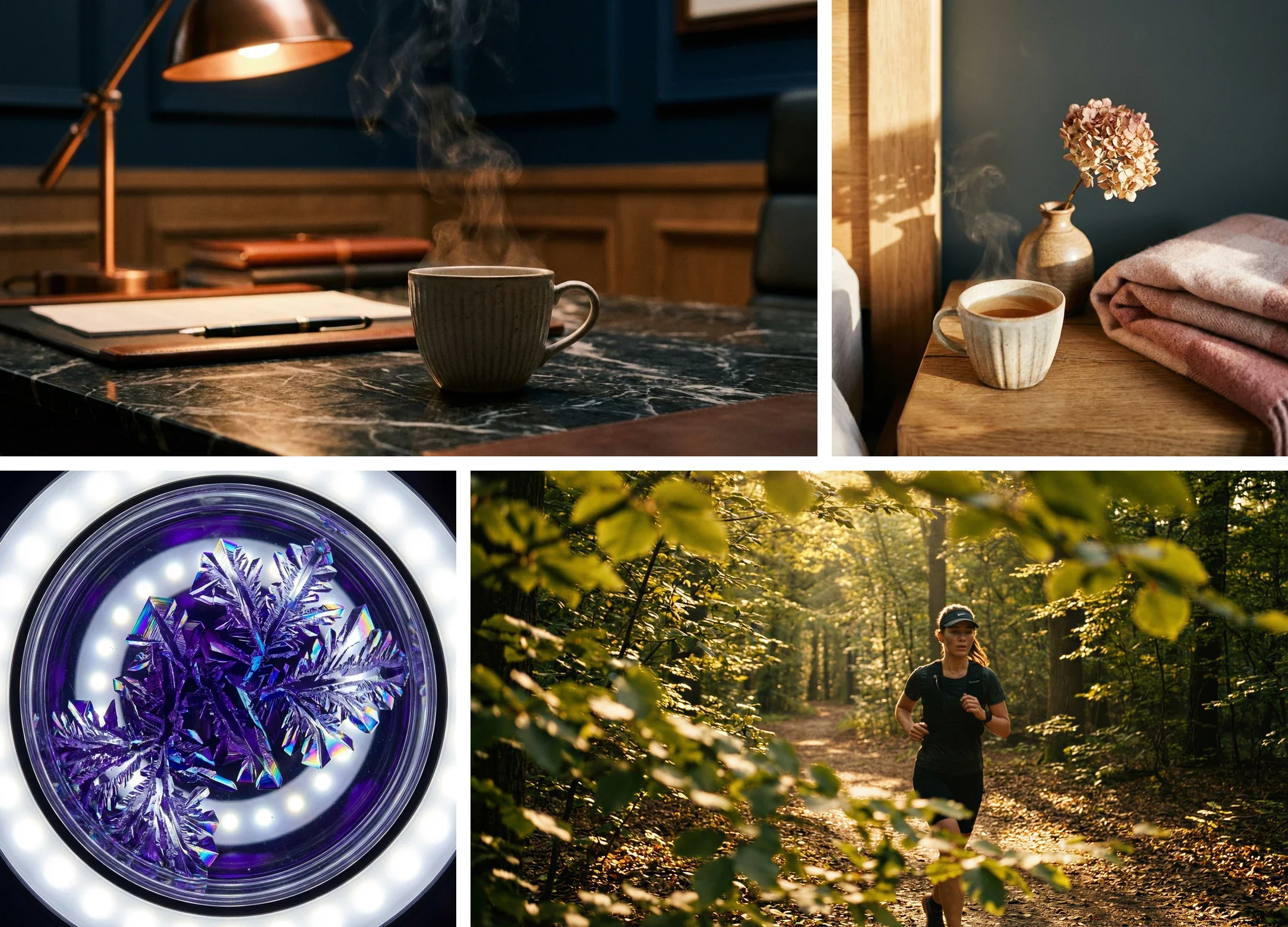
A copper desk lamp in half-light, a cup of tea by a window, violet crystals under a ring light, a runner backlit in a forest
Four light decisions: a lamp in half-light, soft side light, a clinical ring light, golden backlight. Generated with Samsa.

“Bright” and “dark” cover a wide range: on a lightness scale from 0 (black) to 100 (white), the pharma images generated for this guide average 63 and the travel images 22 (Samsa measurement, October 2026).

Write down the direction and the limit, as Vienna does for colour temperature: “Nicht zu warm, nicht zu kühl”, not too warm, not too cool. A dark brand says how deep the shadows may go, for example blacks that keep their detail.

Colour

A colour rule separates the dominant colours, which cover most of the picture, from the accent colours, and says where an accent may appear. It also sets the colour temperature (warm or cool), the saturation and the blacks.

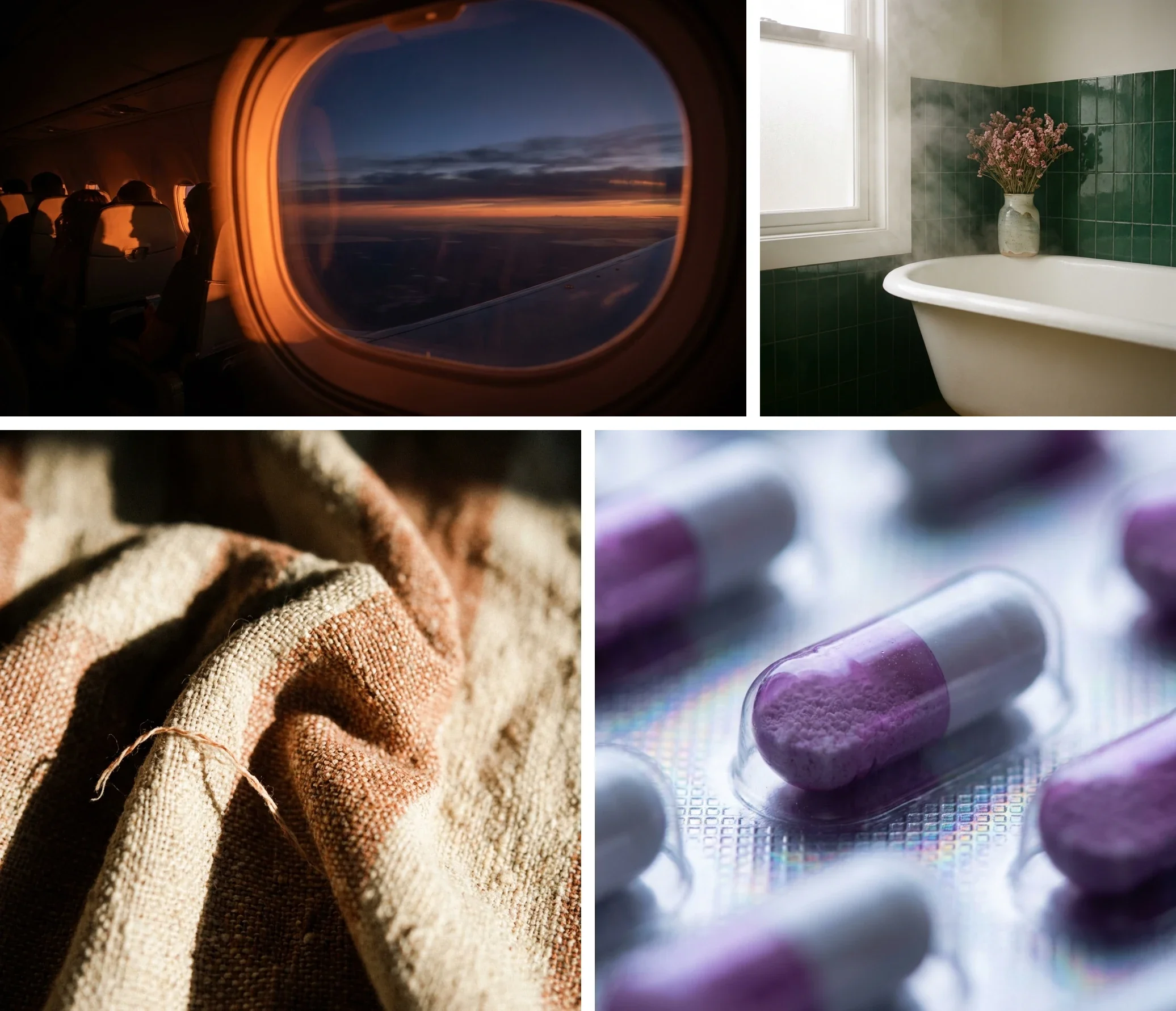
An aircraft window at dusk, then a bathtub against bottle-green tiles, a striped linen textile, violet and white capsules
Four colour codes: amber against midnight blue, bottle green and cream, terracotta and linen, violet and white. Generated with Samsa.

An accent vanishes once you measure: in the bathtub image of this guide’s hospitality set, the pink flowers cover less than 1% of the pixels, and none of the eight dominant colours Samsa extracted from the image is pink.

An accent covers little surface and gets lost fast: write it down with its place, for example “dusty pink: flowers and textiles, never as a background”.

Framing and viewpoint

For framing and viewpoint, one rule each is often enough: where the subject sits and how much space stays free for a headline; how high the camera stands. Marburg names “stürzende Linien”, converging verticals, as something to avoid. And plan for cropping: Bosch wants photos that work in landscape for web articles and in portrait for social media. Leave room around the subject.

Materials and finish

None of the seven public manuals Samsa read sets a rule for materials, yet they are quick to recognise: linen and light wood in this guide’s healthcare images, marble and copper in banking, concrete and dust in construction. Write down the two or three that recur, and the ones that have no place in your brand. On finish, Amsterdam is blunt: “Photos are not edited.” Marburg allows discreet retouching, but no excessive intervention.

How should people appear in your brand imagery?

For people, brand imagery guidelines settle four things: face or no face, where the gaze goes, posed or candid, and who appears and how many.

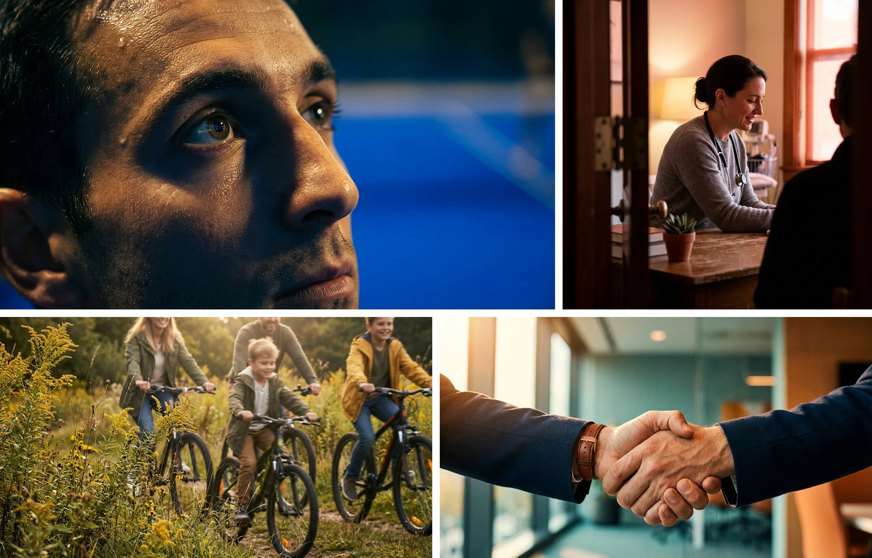
A sweating man’s face in close-up, a consultation seen through a doorway, a family cycling through a meadow, a handshake between two people in suits
Four ways to show people: the face up close, a scene observed through a door, a family in motion, only hands. Generated with Samsa.

Amsterdam asks for diversity: a balance of genders, cultural backgrounds, people with disabilities and age groups, plus a mix of students, lecturers and researchers, and adds: “Avoid photographs that look posed or unnatural.” Marburg ideally wants people who study or work at the university, “also keine gekauften Models sind, die eine Rolle spielen”: not paid models playing a part.

With AI, this rule counts double. A study presented at FAccT 2023 (Bianchi et al.) found that ordinary prompts, naming only a trait, an occupation or an object, produce stereotypes, and that neither asking for counter-stereotypes nor the systems’ safeguards prevented it. The generators tested were 2022 and 2023 versions, but the lesson holds: write the rule, then check every generated image against it.

Real people need to give their consent and sign a model release; Amsterdam requires a release from everyone pictured. For generated people, write down how the images are labelled: see C2PA and visible AI labels.

What does the same method look like in nine sectors?

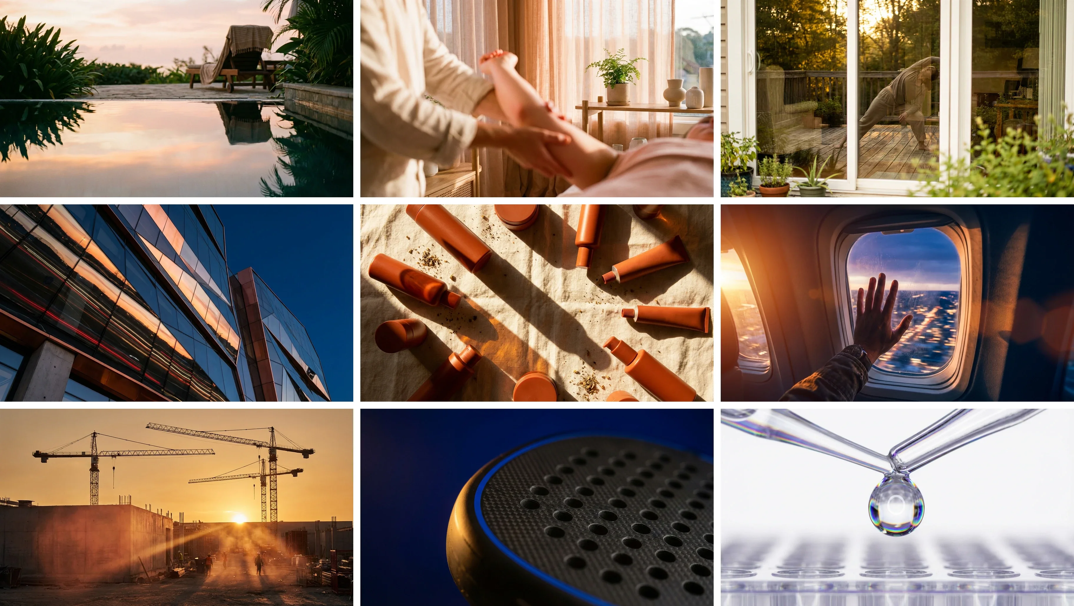
Applied to nine sectors, from hospitality to pharma, the eight brand imagery decisions produce nine different image styles. The images were generated with Samsa, one set per sector, with no real brand; Samsa read the rules off the images themselves.

Nine images: a pool at dusk, physiotherapy, yoga behind glass, a copper facade, terracotta tubes, an aircraft window, cranes, a padel racket, a pipette
Nine sectors, the same eight decisions, nine answers: hospitality, healthcare, insurance, banking, retail, travel, construction, sport and pharma. Generated with Samsa.

On 6 October 2026, Samsa also measured the light and colour of these 25 example images in the CIELAB colour space, averaged per set; a second pass at another resolution gives the same lightness and warmth within 0.4. The values describe these examples, not a sector.

Light and colour of the 25 example images in this guide, generated with Samsa and measured on 6 October 2026
Set (images)Lightness 0–100ContrastWarm + / cool −ColourfulnessTop three colours (hex)
Hospitality (2)5031+911#0f1b0e, #4a4b37, #aea293
Healthcare (3)4426+1620#160905, #a8724e, #41423d
Insurance (3)4122+2627#493d18, #715d27, #9a803d
Banking (3)2922+417#101314, #51321e, #173e5f
Retail (2)4732+2023#1a0d05, #eedcc2, #4d2d16
Travel (2)2219+418#110b0e, #33262e, #763b27
Construction (4)4724+1921#58402c, #7e624c, #a9886a
Padel (3)2415−918#0f1213, #363433, #081435
Pharma (3)6325−1215#eef0f5, #c6cbdd, #625e86

“Warm” is a direction more than a value: seven sets lean warm, banking and travel only just, insurance clearly; pharma and padel lean cool.

Hospitality

A cream bathtub against bottle-green tiles, dusty-pink flowers, steam; an empty pool at dusk. The rules: soft window light or dusk, never flash; bottle green and cream, pink only as a touch; empty spaces, ready for guests.

Samsa’s measurement of these two images: the least colourful set (11) and one of the most contrasted (31).

In Switzerland, the most frequent German-language Google searches for “hotel + photos” each target one specific hotel, for example 170 and 210 a month for two of them (DataForSEO, October 2026). Guests want to see the room they book: keep real photographs for booking, and use AI for mood and campaigns.

Healthcare

A physiotherapy session where you mostly see hands, a cup of tea by a linen curtain, a consultation watched through a doorway. The rules: soft daylight through linen; peach, cream and light wood instead of clinical white; people observed, not staged.

Samsa’s measurement of these three images: lightness 44, clearly warm (+16).

For “Bilder Physiotherapie” (physiotherapy pictures) or “Bilder Arztpraxis” (doctor’s practice pictures), Google Switzerland shows mostly stock libraries and waiting-room wall art (Samsa search, October 2026).

Insurance and health insurance

A runner backlit in a forest, yoga seen through a glass wall, a family cycling through a meadow. The rules: golden hour outdoors, backlit; a frame of leaves or glass; people in motion, not posed.

Samsa’s measurement of these three images: the warmest set (+26) and the most colourful (27).

For “Versicherung Bilder” (insurance pictures), Google Switzerland shows stock photos, statistics graphics and press photos (Samsa search, October 2026).

Banking

A glass-and-copper facade at blue hour, a copper lamp and a steaming cup on marble, a handshake in navy suits. The rules: blue hour and dusk, warm lamps against cool shadow; navy and copper; marble, glass, leather; hands instead of faces.

Samsa’s measurement of these three images: lightness 29, almost neutral (+4).

Five more sectors

Five more sectors, one image rule each (examples generated with Samsa)
SectorThe rule in one line
RetailLow sun and long shadows; terracotta products on linen, shot from above
Travel and airlinesThe aircraft window as the frame; orange cabin glow against the blue of night
ConstructionLow golden sun through dust; concrete, gloves, tools
Sport (padel)Cool hall light and rim light on cobalt blue; tight crops
PharmaVery bright clinical white, violet as the accent, macro

More AI-generated brand visuals apply the same logic to other subjects.

Which reference images belong in your brand imagery guidelines?

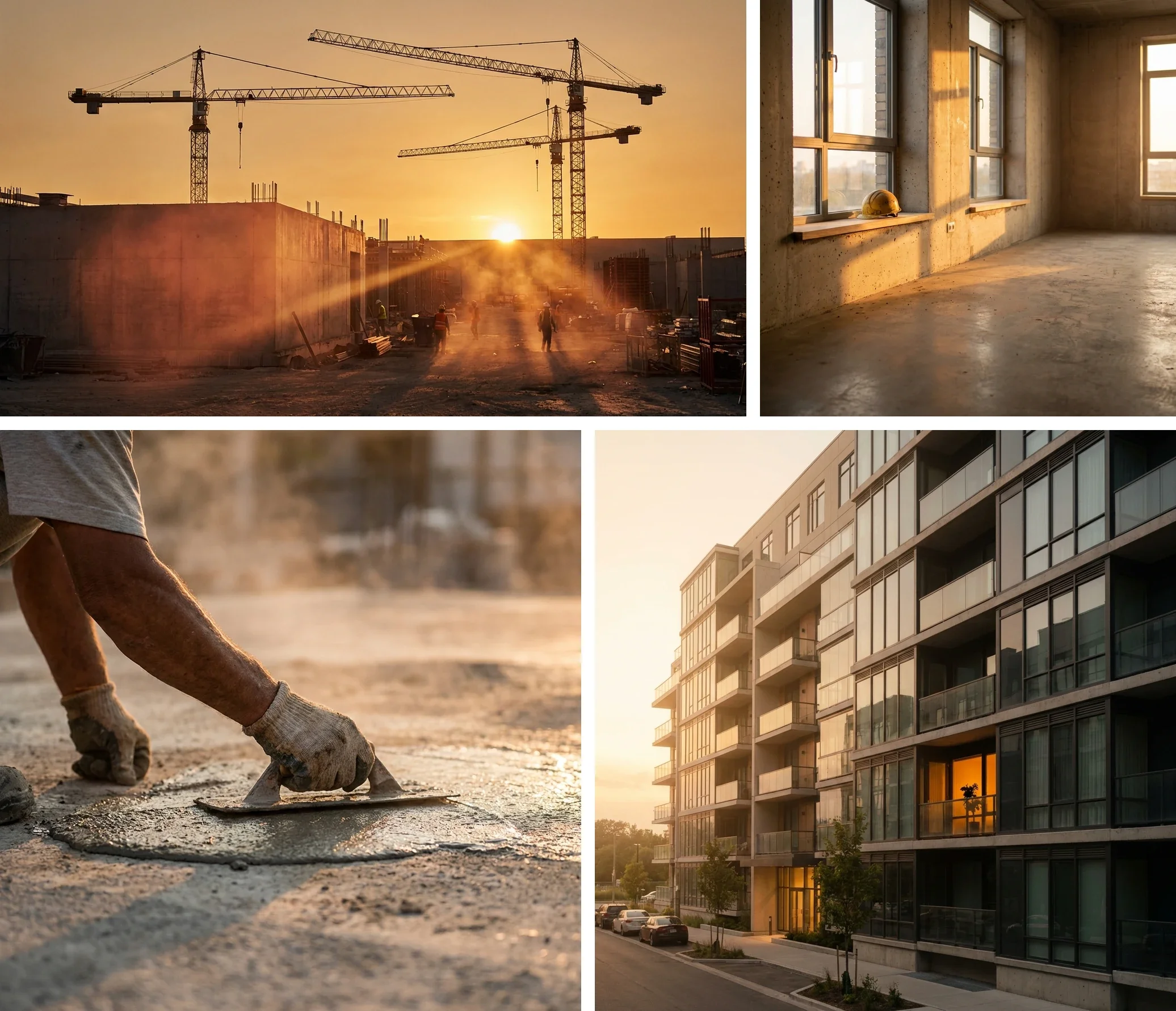
Brand imagery guidelines should hold one or two reference images per image type your brand actually uses: a place, an interior, a detail with hands, people, a product. They share all eight decisions and differ only in subject. Add one counter-example for each decision teams get wrong most often.

Cranes at sunset, then an empty concrete room in low sun, gloved hands smoothing concrete with a trowel, an apartment building at dusk
Four subjects, the same golden light: building site, empty room, hands at work, finished building. Generated with Samsa.

Give every image a one-line caption that names its rule, such as “low sun, never midday”. Without a caption, everyone takes something different from the same picture: one the colour, another the subject.

These images do double duty. They are the art-direction brief for a photographer or an agency, and they are what an AI can learn your look from. The guide on which images to pick for training walks through that selection. For product images, what a packshot needs applies on top.

What must your guidelines say in words?

Six rules cannot be shown in pictures and must be written out in your guidelines: excluded subjects, people, usage, sources and rights, AI, and sign-off.

  • Excluded subjects: a picture shows what is in it, never what is missing. “No screens with readable text” can only be written.
  • People: who appears, and with what consent.
  • Usage: which image goes on which channel, in which format. Fribourg lists key visuals, social media, website, spots, posters and brochures. Samsa generates formats from 9:16 to 21:9, and its AI resize lets you choose to extend the image or crop it, to adapt a visual to every format.
  • Sources and rights: licences, model releases, credits. Amsterdam requires the photographer’s name to be credited in every publication.
  • AI: where it is allowed, whether it may show realistic people, how its images are labelled. ZEISS keeps its own AI rules, labelling included, inside the Imagery chapter of its brand portal, not in a separate policy.
  • Sign-off: a named person, not “the team”.

How do you check an image against your brand imagery rules?

You check an image against your brand imagery rules with one yes-or-no question per decision, the same for a photographer’s delivery, a stock image or an AI-generated image. A single no, and the image goes back.

Brand imagery checklist: one question per decision, plus three checks for AI-generated images
CheckThe question (yes to pass)
LightDo source, direction and time of day match the rule?
ColourAre the dominant colours from the palette, and the accents in their place?
FramingDoes the subject stay whole in every planned format?
ViewpointIs the camera at the planned height?
SubjectsIs the motif one of the families, and off the excluded list?
PeopleWho, how many, which gaze: does it follow the rule, with consent in order?
MaterialsAre the surfaces and props the brand’s own?
FinishDo sharpness, grain and retouching stay within the limit?
AI: anatomyAre hands, faces and bodies free of errors (ZEISS’s “Anatomical glitches”)?
AI: stock lookDoes the image avoid “A generic 'stock' look & feel” (ZEISS)?
AI: filter lookDoes it avoid “Outputs that look like digital filters” (ZEISS)?
Label and rightsIs the AI label applied where your rule requires it, and are the rights clear?

A named person signs off. ZEISS, too, asks brands to “Ensure human oversight and approval are built into the workflow.” A checklist with no name at the end remains a list.

Does a strict imagery chapter make your brand look like everyone else?

A strict imagery chapter makes a brand look like everyone else only if it fixes nothing but what every brand fixes. Consistency is necessary, but it does not make a brand recognisable on its own.

Ward, Yang, Romaniuk and Beal (Journal of Brand Management, 2020) compared 1,281 brand identity elements across 13 consumer-goods categories and 19 countries: colour proved “more challenging to develop as a unique brand identifier due to high levels of competitive sharing” than characters or logos. The study did not look at photography, but a colour alone rarely sets a brand apart.

Image generators add another reason. A 2026 study of text-to-image models released between 2022 and 2025 (Adamkiewicz et al., accepted to CVPR 2026 according to the authors’ arXiv page) finds that they “collapse to a narrow, aesthetic-centric distribution”: their images converge on one narrow, polished look. It studies training data, not brands; but imagery guidelines that only say “bright, warm, authentic” risk getting exactly that look.

Fix what is yours (a light signature, a framing habit, a material) and leave subjects free. Then show the result to people outside the team before you call it recognisable. Whether a prompt, a reference image or a trained model suits you is the subject of another guide.

What does this guide not cover?

  • Logo, typography and layout: other chapters of the brand guidelines.
  • Law: the passages on rights, consent and labels describe practice, not legal advice.
  • The measured values: they describe this guide’s example images, not a sector.
  • Approval: a style model replaces neither the written rules nor the person who checks.
  • Distinctiveness: consistency alone does not make a brand recognisable.

Brand imagery: frequently asked questions

What should brand guidelines include?

Brand guidelines should include the logo, the colour palette (with RGB, CMYK and hex values) and typography first, then imagery, graphic elements such as icons, and the layout grid. The first three are usually specified down to the value; imagery more often stops at a few adjectives. That makes the imagery chapter the place where precise rules gain you the most.

What is the difference between brand imagery and a brand style guide?

A brand style guide is the whole document: logo, colours, typography, tone of voice, layout and imagery. Brand imagery is one part of it, the rules for how photos and illustrations look. In practice, the imagery chapter is also the part you hand a photographer, an agency or an AI as a brief, together with its reference images.

Do AI-generated images need their own section?

No: light, colour, framing and the other brand imagery decisions apply to an AI-generated image just as they do to a photo. Add a few AI-specific rules to the same chapter instead, plus a person who signs off. In Samsa, generated images carry C2PA Content Credentials and an imperceptible watermark; visible AI labels, using the official EU icons or your own label in your brand’s design, can be switched on per workspace (security and transparency).

Can a stock photo fit your brand imagery?

Yes: a stock photo fits your brand imagery if it passes the same check as any other image and its licence covers your use. The risk lies in generic motifs, the overly predictable scenes your audience has already seen from other brands. Pick images that match your light, colour and materials, and check the licence for every channel.

Do illustrations need their own rules in brand imagery guidelines?

Yes. In brand imagery guidelines, illustrations follow the same decisions as photos, translated for drawing: line, palette, level of detail, texture and how people are drawn. Keep one illustration style per set of examples; two mixed styles give everyone an excuse to invent a third. And if your brand uses both, write down when photography applies and when illustration does.

Can an AI follow your brand imagery guidelines?

For the look, yes: a Samsa style model learns the photographic look, the colours and the typography of the reference images in your brand imagery guidelines; text it renders follows your brand’s typographic style, without reproducing your exact typeface. Training a Samsa style model is free on every plan and takes about 15 seconds. The written part (excluded subjects, people, usage) still needs a person who checks every image against the rules.

Sources

  1. Bildsprache, Stadt Wien, accessed 7 October 2026
  2. Bildsprache, Philipps-Universität Marburg, accessed 7 October 2026
  3. Photography, University of Amsterdam, accessed 7 October 2026
  4. Corporate Photography Guidelines – Die Bildwelt der Robert Bosch Stiftung, Robert Bosch Stiftung, accessed 7 October 2026
  5. Charte graphique de la Ville de Fribourg, Ville de Fribourg, accessed 7 October 2026
  6. EasyGov Corporate Design Manual, Version 1.1, Staatssekretariat für Wirtschaft SECO, accessed 7 October 2026
  7. Ein System – mehr als ein Logo, Kanton Zug, accessed 7 October 2026
  8. Generative AI, ZEISS, accessed 7 October 2026
  9. Easily Accessible Text-to-Image Generation Amplifies Demographic Stereotypes at Large Scale, Bianchi et al., FAccT 2023 (arXiv), accessed 6 October 2026
  10. When Pretty Isn’t Useful: Investigating Why Modern Text-to-Image Models Fail as Reliable Training Data Generators, Adamkiewicz et al. (arXiv), accessed 6 October 2026
  11. Building a unique brand identity: measuring the relative ownership potential of brand identity element types, Ward, Yang, Romaniuk & Beal, Journal of Brand Management, accessed 6 October 2026

Turn your reference images into a style model

A style model learns the look, the colours and the typography of your reference images. Training is free on every plan and takes about 15 seconds. Your account is free; images use your plan’s credits.

# Brand imagery: the 8 decisions your brand guidelines must make

> Brand imagery guidelines in 8 decisions: light, colour, framing, people and more, written so photographers, agencies and AI deliver one consistent look.

Language: English · Machine index: [https://samsa.ai/llms.txt](/llms.txt)

---

Brand imagery guidelines set how every photo and illustration of your brand looks, so that whoever makes it delivers the same look: a photographer, an agency, a colleague or an AI. They come down to eight decisions: light, colour, framing, viewpoint, subjects, people, materials and finish. Write each one as a rule someone else can check, show it with reference images, and list what must never appear.

Niklas Jung · Founder & CEO, Samsa Published 2026-11-04 · 18 min read

---

## What is brand imagery?

Brand imagery is the look of every picture a brand puts out, and brand imagery guidelines are the chapter of the brand guidelines that fixes it: photos, illustrations and, these days, AI-generated visuals. You will also see it called a photography style guide or imagery guidelines.

The chapter is not about one good picture but about what all your pictures share. A great photo can match your brand by accident. The series shows whether the rules hold, down to the twentieth shot from a photographer you have never met, the agency’s banner, or the visual a colleague generates at 5 pm on a Friday.

It is also the chapter brand manuals most often leave to adjectives. Of seven public brand manuals Samsa read in October 2026, not one sets a rule for materials.

---

## Which decisions do brand imagery guidelines need to make?

Brand imagery guidelines need to make eight decisions: light, colour, framing, viewpoint, subjects, people, materials and finish. Each one is written as a rule an outsider can check against the picture, not as an adjective.

**The eight decisions of brand imagery, and the checkable rule that replaces the adjective**

| Decision | What it settles | A checkable rule (example) | The adjective it replaces |

| --- | --- | --- | --- |

| Light | Source, direction, hardness, time of day, bright or dark | “Daylight from the side, no flash, never midday sun” | “bright” |

| Colour | Dominant colours, accents and where they go, warm or cool, saturation, blacks | “Warm tones, dense blacks, no black and white without a reason” | “warm” |

| Framing | Where the subject sits, distance, space for text, cropping per format | “Subject in the right third, one third left free for text” | “clean” |

| Viewpoint | Camera height, close or wide | “At eye level, never from above” | “approachable” |

| Subjects | The motif families, and what you never show | “Four motif families; no light bulb to mean ‘idea’” | “authentic” |

| People | Who, how many, faces or hands, gaze, posed or candid | “Real employees, looking past the camera” | “diverse” |

| Materials | Surfaces, materials and props that recur | “Linen, oak, stone; no glossy plastic” | “premium” |

| Finish | Depth of field, background blur, grain, retouching, filters | “Softly blurred background, light grain, no beauty retouching” | “high-end” |

An adjective lets everyone else decide for you: “warm” is golden backlight to the photographer, an orange filter to the agency and its default look to an image generator. Next to the eight decisions, the guidelines keep two lists: do’s and don’ts, shown as pictures, and usage, which image goes on which channel and in which format.

---

## What do real brand manuals define, and what do they leave open?

The seven public brand manuals Samsa read in October 2026 all set a rule for light and all address colour; none sets a rule for materials, and only one has a rule on AI-generated images in its imagery chapter.

They are the manuals of the City of Vienna, Philipps-Universität Marburg, the University of Amsterdam, the Robert Bosch Stiftung, the City of Fribourg, the Swiss State Secretariat for Economic Affairs SECO (for EasyGov) and the Canton of Zug: public bodies and a foundation, no software vendor and no Samsa customer. Samsa read each imagery chapter in full and noted, decision by decision, whether it sets a checkable rule, stops at an adjective or says nothing. Seven manuals are not a statistic.

**What the imagery chapters of seven public brand manuals define, read by Samsa in October 2026**

| Decision | Manuals with a rule | One example |

| --- | --- | --- |

| Light | 7 of 7 | Vienna: “Keine hohe Sonneneinstrahlung, kein Kunstlicht” (no high sun, no artificial light) |

| Colour | 6 of 7 (Marburg: an optional filter only) | Fribourg: “Noirs denses et non-bouchées” (dense blacks that keep their detail) |

| Subjects | 6 of 7 (Bosch: adjectives) | SECO: work situations that look natural |

| Viewpoint | 3 of 7 | Bosch: at eye level, at most slightly from below |

| People | 3 of 7 | Amsterdam: a balance of genders, cultural backgrounds and age groups |

| Framing | 2 of 7 | Bosch: every photo must work in landscape and in portrait |

| Focus | 2 of 7 | Bosch: “charakteristische Unschärfen zur Fokussetzung” (deliberate blur to guide the eye) |

| Finish | 4 of 7 | Amsterdam: “Photos are not edited.” |

| Materials | 0 of 7 | – |

| AI-generated images | 1 of 7 | Amsterdam: “AI is not used for realistic images.” |

Fribourg lists among the photos to avoid “Blancs surexposés, des noirs bouchés ou grisés”: blown-out whites, blocked or greyed blacks. That is a rule you can check on the picture. Mood, on the other hand, stays an adjective everywhere, as in Bosch’s “Authentisch, Menschen- & werteorientiert” (authentic, people- and values-oriented). Only Vienna shows its positive and negative examples as pictures; the others, where they have don’ts, write them as text.

Gaze shows the difference between a rule and a permission. Bosch writes “direkten Blickkontakt mit der Kamera vermeiden” (avoid direct eye contact with the camera); Marburg writes “Der Blick darf gerne an der Kamera vorbeigehen” (the gaze may well go past the camera). Both lean the same way, but only Bosch can be checked: when someone looks straight into the lens, Bosch says no and Marburg says nothing.

Any decision a manual leaves open, an image generator fills with its own taste. In the seven public manuals Samsa read, that is mostly materials (0 of 7), framing and focus (2 of 7 each). If you add only three rules to your guidelines, start with those.

---

## How do you write an image rule someone else can check?

A checkable image rule gives a value, or a limit on both sides, and is shown with one picture that meets it and one that misses. “Natural light” cannot be checked; “daylight from the side, no flash, no midday sun” can. The counter-example does half the work: a right picture next to an almost-right one shows where the line is.

### Light

A light rule can go down to the hour. The Canton of Zug writes “Die Bilder wirken hell, leicht und unbeschwert (Frühlingsmorgen 7.30 Uhr)”: bright, light and carefree, like a spring morning at 7:30. SECO keeps its photos “in klaren Farben und einer warmen, angenehmen Lichtstimmung”, in clear colours and a warm, pleasant light, without strong flash or hard contrast.
*(image: A copper desk lamp in half-light, a cup of tea by a window, violet crystals under a ring light, a runner backlit in a forest)*

Four light decisions: a lamp in half-light, soft side light, a clinical ring light, golden backlight. Generated with Samsa.

“Bright” and “dark” cover a wide range: on a lightness scale from 0 (black) to 100 (white), the pharma images generated for this guide average 63 and the travel images 22 (Samsa measurement, October 2026).

Write down the direction and the limit, as Vienna does for colour temperature: “Nicht zu warm, nicht zu kühl”, not too warm, not too cool. A dark brand says how deep the shadows may go, for example blacks that keep their detail.

### Colour

A colour rule separates the dominant colours, which cover most of the picture, from the accent colours, and says where an accent may appear. It also sets the colour temperature (warm or cool), the saturation and the blacks.
*(image: An aircraft window at dusk, then a bathtub against bottle-green tiles, a striped linen textile, violet and white capsules)*

Four colour codes: amber against midnight blue, bottle green and cream, terracotta and linen, violet and white. Generated with Samsa.

An accent vanishes once you measure: in the bathtub image of this guide’s hospitality set, the pink flowers cover less than 1% of the pixels, and none of the eight dominant colours Samsa extracted from the image is pink.

An accent covers little surface and gets lost fast: write it down with its place, for example “dusty pink: flowers and textiles, never as a background”.

### Framing and viewpoint

For framing and viewpoint, one rule each is often enough: where the subject sits and how much space stays free for a headline; how high the camera stands. Marburg names “stürzende Linien”, converging verticals, as something to avoid. And plan for cropping: Bosch wants photos that work in landscape for web articles and in portrait for social media. Leave room around the subject.

### Materials and finish

None of the seven public manuals Samsa read sets a rule for materials, yet they are quick to recognise: linen and light wood in this guide’s healthcare images, marble and copper in banking, concrete and dust in construction. Write down the two or three that recur, and the ones that have no place in your brand. On finish, Amsterdam is blunt: “Photos are not edited.” Marburg allows discreet retouching, but no excessive intervention.

---

## How should people appear in your brand imagery?

For people, brand imagery guidelines settle four things: face or no face, where the gaze goes, posed or candid, and who appears and how many.
*(image: A sweating man’s face in close-up, a consultation seen through a doorway, a family cycling through a meadow, a handshake between two people in suits)*

Four ways to show people: the face up close, a scene observed through a door, a family in motion, only hands. Generated with Samsa.

Amsterdam asks for diversity: a balance of genders, cultural backgrounds, people with disabilities and age groups, plus a mix of students, lecturers and researchers, and adds: “Avoid photographs that look posed or unnatural.” Marburg ideally wants people who study or work at the university, “also keine gekauften Models sind, die eine Rolle spielen”: not paid models playing a part.

With AI, this rule counts double. A study presented at FAccT 2023 (Bianchi et al.) found that ordinary prompts, naming only a trait, an occupation or an object, produce stereotypes, and that neither asking for counter-stereotypes nor the systems’ safeguards prevented it. The generators tested were 2022 and 2023 versions, but the lesson holds: write the rule, then check every generated image against it.

Real people need to give their consent and sign a model release; Amsterdam requires a release from everyone pictured. For generated people, write down how the images are labelled: see [C2PA and visible AI labels](/security/).

---

## What does the same method look like in nine sectors?

Applied to nine sectors, from hospitality to pharma, the eight brand imagery decisions produce nine different image styles. The images were generated with Samsa, one set per sector, with no real brand; Samsa read the rules off the images themselves.
*(image: Nine images: a pool at dusk, physiotherapy, yoga behind glass, a copper facade, terracotta tubes, an aircraft window, cranes, a padel racket, a pipette)*

Nine sectors, the same eight decisions, nine answers: hospitality, healthcare, insurance, banking, retail, travel, construction, sport and pharma. Generated with Samsa.

On 6 October 2026, Samsa also measured the light and colour of these 25 example images in the CIELAB colour space, averaged per set; a second pass at another resolution gives the same lightness and warmth within 0.4. The values describe these examples, not a sector.

**Light and colour of the 25 example images in this guide, generated with Samsa and measured on 6 October 2026**

| Set (images) | Lightness 0–100 | Contrast | Warm + / cool − | Colourfulness | Top three colours (hex) |

| --- | --- | --- | --- | --- | --- |

| Hospitality (2) | 50 | 31 | +9 | 11 | #0f1b0e, #4a4b37, #aea293 |

| Healthcare (3) | 44 | 26 | +16 | 20 | #160905, #a8724e, #41423d |

| Insurance (3) | 41 | 22 | +26 | 27 | #493d18, #715d27, #9a803d |

| Banking (3) | 29 | 22 | +4 | 17 | #101314, #51321e, #173e5f |

| Retail (2) | 47 | 32 | +20 | 23 | #1a0d05, #eedcc2, #4d2d16 |

| Travel (2) | 22 | 19 | +4 | 18 | #110b0e, #33262e, #763b27 |

| Construction (4) | 47 | 24 | +19 | 21 | #58402c, #7e624c, #a9886a |

| Padel (3) | 24 | 15 | −9 | 18 | #0f1213, #363433, #081435 |

| Pharma (3) | 63 | 25 | −12 | 15 | #eef0f5, #c6cbdd, #625e86 |

“Warm” is a direction more than a value: seven sets lean warm, banking and travel only just, insurance clearly; pharma and padel lean cool.

### Hospitality

A cream bathtub against bottle-green tiles, dusty-pink flowers, steam; an empty pool at dusk. The rules: soft window light or dusk, never flash; bottle green and cream, pink only as a touch; empty spaces, ready for guests.

Samsa’s measurement of these two images: the least colourful set (11) and one of the most contrasted (31).

In Switzerland, the most frequent German-language Google searches for “hotel + photos” each target one specific hotel, for example 170 and 210 a month for two of them (DataForSEO, October 2026). Guests want to see the room they book: keep real photographs for booking, and use AI for mood and campaigns.

### Healthcare

A physiotherapy session where you mostly see hands, a cup of tea by a linen curtain, a consultation watched through a doorway. The rules: soft daylight through linen; peach, cream and light wood instead of clinical white; people observed, not staged.

Samsa’s measurement of these three images: lightness 44, clearly warm (+16).

For “Bilder Physiotherapie” (physiotherapy pictures) or “Bilder Arztpraxis” (doctor’s practice pictures), Google Switzerland shows mostly stock libraries and waiting-room wall art (Samsa search, October 2026).

### Insurance and health insurance

A runner backlit in a forest, yoga seen through a glass wall, a family cycling through a meadow. The rules: golden hour outdoors, backlit; a frame of leaves or glass; people in motion, not posed.

Samsa’s measurement of these three images: the warmest set (+26) and the most colourful (27).

For “Versicherung Bilder” (insurance pictures), Google Switzerland shows stock photos, statistics graphics and press photos (Samsa search, October 2026).

### Banking

A glass-and-copper facade at blue hour, a copper lamp and a steaming cup on marble, a handshake in navy suits. The rules: blue hour and dusk, warm lamps against cool shadow; navy and copper; marble, glass, leather; hands instead of faces.

Samsa’s measurement of these three images: lightness 29, almost neutral (+4).

### Five more sectors

**Five more sectors, one image rule each (examples generated with Samsa)**

| Sector | The rule in one line |

| --- | --- |

| Retail | Low sun and long shadows; terracotta products on linen, shot from above |

| Travel and airlines | The aircraft window as the frame; orange cabin glow against the blue of night |

| Construction | Low golden sun through dust; concrete, gloves, tools |

| Sport (padel) | Cool hall light and rim light on cobalt blue; tight crops |

| Pharma | Very bright clinical white, violet as the accent, macro |

More [AI-generated brand visuals](/examples/) apply the same logic to other subjects.

---

## Which reference images belong in your brand imagery guidelines?

Brand imagery guidelines should hold one or two reference images per image type your brand actually uses: a place, an interior, a detail with hands, people, a product. They share all eight decisions and differ only in subject. Add one counter-example for each decision teams get wrong most often.
*(image: Cranes at sunset, then an empty concrete room in low sun, gloved hands smoothing concrete with a trowel, an apartment building at dusk)*

Four subjects, the same golden light: building site, empty room, hands at work, finished building. Generated with Samsa.

Give every image a one-line caption that names its rule, such as “low sun, never midday”. Without a caption, everyone takes something different from the same picture: one the colour, another the subject.

These images do double duty. They are the art-direction brief for a photographer or an agency, and they are what an AI can learn your look from. The guide on [which images to pick for training](https://samsa.ai/guides/train-ai-on-brand-guidelines/) walks through that selection. For product images, [what a packshot needs](https://samsa.ai/guides/packshot/) applies on top.

---

## What must your guidelines say in words?

Six rules cannot be shown in pictures and must be written out in your guidelines: excluded subjects, people, usage, sources and rights, AI, and sign-off.

- Excluded subjects: a picture shows what is in it, never what is missing. “No screens with readable text” can only be written.

- People: who appears, and with what consent.

- Usage: which image goes on which channel, in which format. Fribourg lists key visuals, social media, website, spots, posters and brochures. Samsa generates formats from 9:16 to 21:9, and its AI resize lets you choose to extend the image or crop it, to [adapt a visual to every format](/edit/).

- Sources and rights: licences, model releases, credits. Amsterdam requires the photographer’s name to be credited in every publication.

- AI: where it is allowed, whether it may show realistic people, how its images are labelled. ZEISS keeps its own AI rules, labelling included, inside the Imagery chapter of its brand portal, not in a separate policy.

- Sign-off: a named person, not “the team”.

---

## How do you check an image against your brand imagery rules?

You check an image against your brand imagery rules with one yes-or-no question per decision, the same for a photographer’s delivery, a stock image or an AI-generated image. A single no, and the image goes back.

**Brand imagery checklist: one question per decision, plus three checks for AI-generated images**

| Check | The question (yes to pass) |

| --- | --- |

| Light | Do source, direction and time of day match the rule? |

| Colour | Are the dominant colours from the palette, and the accents in their place? |

| Framing | Does the subject stay whole in every planned format? |

| Viewpoint | Is the camera at the planned height? |

| Subjects | Is the motif one of the families, and off the excluded list? |

| People | Who, how many, which gaze: does it follow the rule, with consent in order? |

| Materials | Are the surfaces and props the brand’s own? |

| Finish | Do sharpness, grain and retouching stay within the limit? |

| AI: anatomy | Are hands, faces and bodies free of errors (ZEISS’s “Anatomical glitches”)? |

| AI: stock look | Does the image avoid “A generic 'stock' look & feel” (ZEISS)? |

| AI: filter look | Does it avoid “Outputs that look like digital filters” (ZEISS)? |

| Label and rights | Is the AI label applied where your rule requires it, and are the rights clear? |

A named person signs off. ZEISS, too, asks brands to “Ensure human oversight and approval are built into the workflow.” A checklist with no name at the end remains a list.

---

## Does a strict imagery chapter make your brand look like everyone else?

A strict imagery chapter makes a brand look like everyone else only if it fixes nothing but what every brand fixes. Consistency is necessary, but it does not make a brand recognisable on its own.

Ward, Yang, Romaniuk and Beal (Journal of Brand Management, 2020) compared 1,281 brand identity elements across 13 consumer-goods categories and 19 countries: colour proved “more challenging to develop as a unique brand identifier due to high levels of competitive sharing” than characters or logos. The study did not look at photography, but a colour alone rarely sets a brand apart.

Image generators add another reason. A 2026 study of text-to-image models released between 2022 and 2025 (Adamkiewicz et al., accepted to CVPR 2026 according to the authors’ arXiv page) finds that they “collapse to a narrow, aesthetic-centric distribution”: their images converge on one narrow, polished look. It studies training data, not brands; but imagery guidelines that only say “bright, warm, authentic” risk getting exactly that look.

Fix what is yours (a light signature, a framing habit, a material) and leave subjects free. Then show the result to people outside the team before you call it recognisable. Whether a [prompt, a reference image or a trained model](https://samsa.ai/guides/on-brand-ai-images-three-approaches/) suits you is the subject of another guide.

---

## What does this guide not cover?

- Logo, typography and layout: other chapters of the brand guidelines.

- Law: the passages on rights, consent and labels describe practice, not legal advice.

- The measured values: they describe this guide’s example images, not a sector.

- Approval: a style model replaces neither the written rules nor the person who checks.

- Distinctiveness: consistency alone does not make a brand recognisable.

---

## Brand imagery: frequently asked questions

### What should brand guidelines include?

Brand guidelines should include the logo, the colour palette (with RGB, CMYK and hex values) and typography first, then imagery, graphic elements such as icons, and the layout grid. The first three are usually specified down to the value; imagery more often stops at a few adjectives. That makes the imagery chapter the place where precise rules gain you the most.

### What is the difference between brand imagery and a brand style guide?

A brand style guide is the whole document: logo, colours, typography, tone of voice, layout and imagery. Brand imagery is one part of it, the rules for how photos and illustrations look. In practice, the imagery chapter is also the part you hand a photographer, an agency or an AI as a brief, together with its reference images.

### Do AI-generated images need their own section?

No: light, colour, framing and the other brand imagery decisions apply to an AI-generated image just as they do to a photo. Add a few AI-specific rules to the same chapter instead, plus a person who signs off. In Samsa, generated images carry C2PA Content Credentials and an imperceptible watermark; visible AI labels, using the official EU icons or your own label in your brand’s design, can be switched on per workspace ([security and transparency](/security/)).

### Can a stock photo fit your brand imagery?

Yes: a stock photo fits your brand imagery if it passes the same check as any other image and its licence covers your use. The risk lies in generic motifs, the overly predictable scenes your audience has already seen from other brands. Pick images that match your light, colour and materials, and check the licence for every channel.

### Do illustrations need their own rules in brand imagery guidelines?

Yes. In brand imagery guidelines, illustrations follow the same decisions as photos, translated for drawing: line, palette, level of detail, texture and how people are drawn. Keep one illustration style per set of examples; two mixed styles give everyone an excuse to invent a third. And if your brand uses both, write down when photography applies and when illustration does.

### Can an AI follow your brand imagery guidelines?

For the look, yes: a Samsa [style model](/train/) learns the photographic look, the colours and the typography of the reference images in your brand imagery guidelines; text it renders follows your brand’s typographic style, without reproducing your exact typeface. Training a Samsa style model is free on every plan and takes about 15 seconds. The written part (excluded subjects, people, usage) still needs a person who checks every image against the rules.

---

## Sources

1. [Bildsprache](https://handbuch.wien.gv.at/v1/look-and-feel/bildsprache/) — Stadt Wien, accessed 2026-10-07

2. [Bildsprache](https://www.uni-marburg.de/de/universitaet/presse/cd-portal/marke-cd/basiselemente/bildsprache) — Philipps-Universität Marburg, accessed 2026-10-07

3. [Photography](https://www.uva.nl/en/about-the-uva/about-the-university/corporate-identity/corporate-identity-elements/imagery/photography/photography.html) — University of Amsterdam, accessed 2026-10-07

4. [Corporate Photography Guidelines – Die Bildwelt der Robert Bosch Stiftung](https://bosch-stiftung.de/sites/default/files/documents/2023-07/20230721_Robert%20Bosch%20Stiftung_CorporatePhotographyGuidelines_DE.pdf) — Robert Bosch Stiftung, accessed 2026-10-07

5. [Charte graphique de la Ville de Fribourg](https://www.ville-fribourg.ch/sites/default/files/inline-files/202509_Ville%20Fribourg_Charte_RE5.pdf) — Ville de Fribourg, accessed 2026-10-07

6. [EasyGov Corporate Design Manual, Version 1.1](https://behoerden.easygov.swiss/) — Staatssekretariat für Wirtschaft SECO, accessed 2026-10-07

7. [Ein System – mehr als ein Logo](https://publiclogin1.zg.ch/dam/jcr:f100b3ba-fa8b-457c-86bd-283001a7269d/Manual%20CD%20Kanton%20Zug.pdf) — Kanton Zug, accessed 2026-10-07

8. [Generative AI](https://brand.zeiss.com/en/brand-design-elements/imagery/generative-ai) — ZEISS, accessed 2026-10-07

9. [Easily Accessible Text-to-Image Generation Amplifies Demographic Stereotypes at Large Scale](https://arxiv.org/abs/2211.03759) — Bianchi et al., FAccT 2023 (arXiv), accessed 2026-10-06

10. [When Pretty Isn’t Useful: Investigating Why Modern Text-to-Image Models Fail as Reliable Training Data Generators](https://arxiv.org/abs/2602.19946) — Adamkiewicz et al. (arXiv), accessed 2026-10-06

11. [Building a unique brand identity: measuring the relative ownership potential of brand identity element types](https://doi.org/10.1057/s41262-020-00187-6) — Ward, Yang, Romaniuk & Beal, Journal of Brand Management, accessed 2026-10-06

---

**Turn your reference images into a style model** A style model learns the look, the colours and the typography of your reference images. Training is free on every plan and takes about 15 seconds. Your account is free; images use your plan’s credits. [See style models](/train/)